Quality of Service Monitoring
Telecommunications Pipeline

Problem
The company were looking for a flexible dashboard and framework for their team to be able to monitor their systems pipeline for quality of service. Users would be Engineers, Department Managers, Marketing and Support, so needed to be configurable for their different needs.
Client Multinational Telecoms Company in the West Coast, USA
Team 1x Product Designer, 1x Front-end Engineer, 1x Project Manager
My Role Product Designer. Working closely with the project manager and the front-end engineer to delivery a viable product to the client.
The project that made me a morning person
As the client was in the west coast of the USA, it meant that we could set up a routine of delivering new work end of day for us and then receive feedback by the morning.
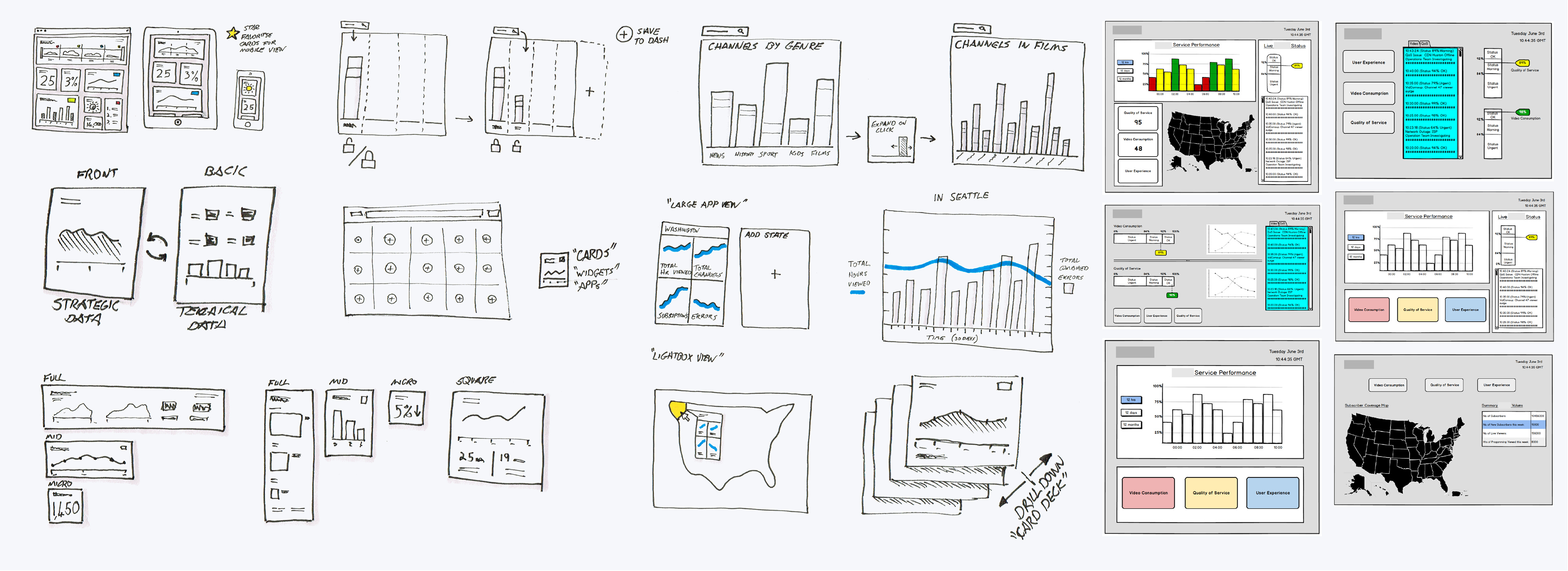
Like all my work, I started on paper looking at individual elements and the data that needed to be shown. It soon became clear that having a dashboard page for each aspect of the pipeline would not work.
Custom Interactions
"Shuffle Button"
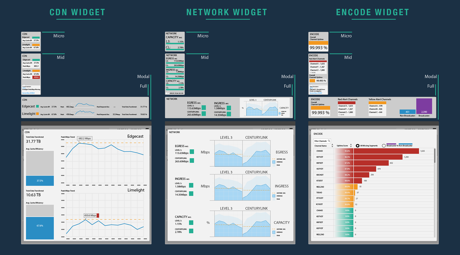
I came up against a number of design challenges with this project. A good example of this are the stacked bar charts, where the data becomes hard to read when there is more than three sections. It is difficult to compare them when they are not on the same level. To resolve this I designed a shuffle button which circulated the data rebasing the data each time.
Due to the huge number of media channels available to show and that only curtain ones were of interest to set users. I designed a custom chart which allowed the user to search and then lock in the channels they needed.

Solution
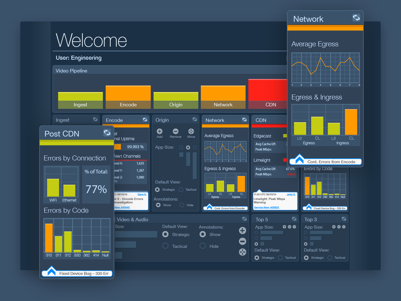
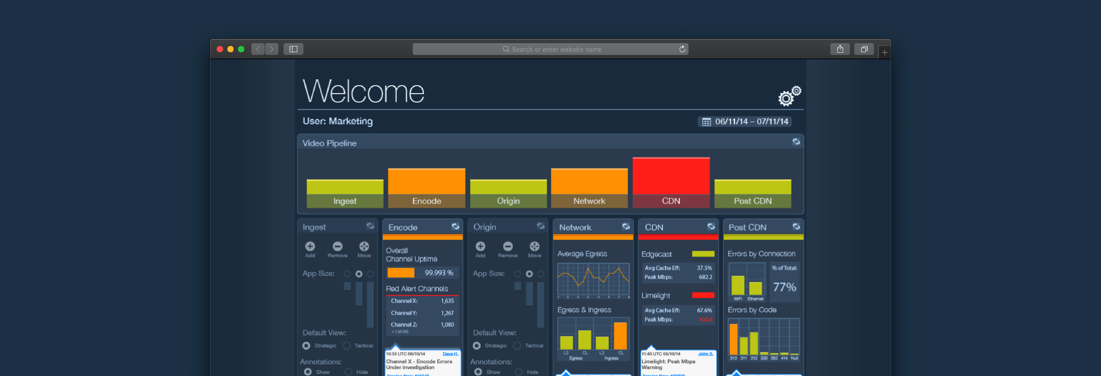
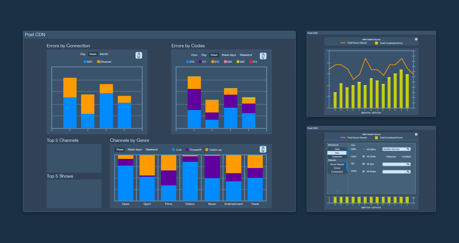
Errors and latency have a knock on effect all the way down the pipeline to the customer, so it is important to keep an eye on this to stop problems occurring. Monitoring data from the ingestion of video, through nationwide distribution, all the way down to errors on customers set-top boxes.
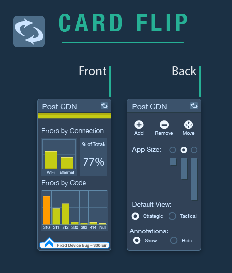
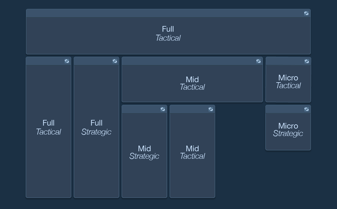
To allow flexibility for the range of different users, I designed the dashboard around the card motif. This allows the users to select the amount of information they require visible and therefore the size of the card needed. The three different sizes were micro, mid and full.
User Comments
Due to the size of the company, visibility on what bugs and tickets were being worked on was vital. I added room for comments for the user to establish if a ticket had been raised for the problem.